Explore and Custom Dashboards
The Explore and Custom Dashboards feature is designed to help you explore and utilize all the metrics Hatica offers. It provides the flexibility to query specific data, visualize it, and build custom dashboards tailored to your needs.
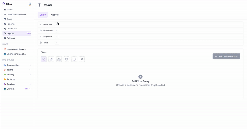
This is divided into two main tabs: Query and Metrics.
- Query: Use the Query tab to build custom queries. Select metrics, apply filters, and create visualizations tailored to specific insights. These queries can be saved as widgets and added to custom dashboards for monitoring key metrics.
- Metrics: The Metrics tab offers a pre-configured grid of all the metrics Hatica tracks. You can filter by team, repository, or date range, and add the customised grid to your custom dashboards. This tab provides a ready-to-use overview for tracking engineering performance metrics with minimal setup.
Together, these tabs enable you to create dashboards tailored to your organization’s needs, helping you track performance and productivity in a way that works best for you.
Query Builder
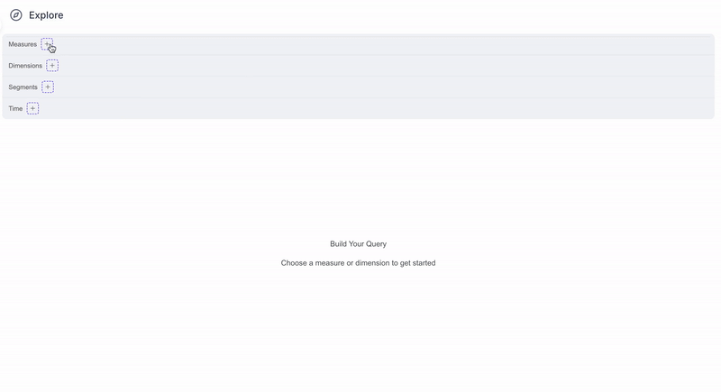
The Query Builder is the primary tool for querying and building custom dashboards. Its user-friendly interface enables you to create custom widgets, monitor specific data points, and expand beyond Hatica's default metrics and dashboards.
Parameters
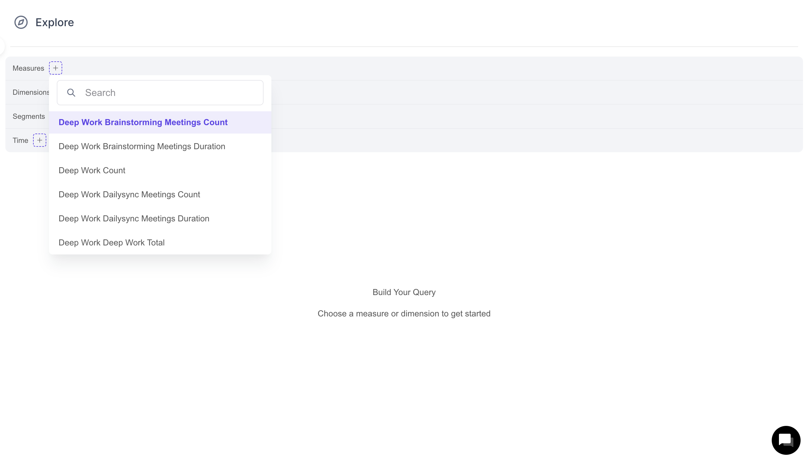
- Measures: Quantitative metrics that Hatica tracks. These are the numbers you use to measure engineering performance, like total counts (e.g., Pull Requests Count) or averages (e.g., Pull Request Merge Time Avg).
- Dimensions: Qualitative attributes that categorize or describe your data. These are the details that help you understand your measures, like the date a pull request was created (Pull Request Creation Date) or the team that worked on it (Team).
- Segments: Segments are subsets of your data that share certain characteristics. They allow you to focus on and compare specific groups within your data.
- Time: The time parameter specifies the time range for your data analysis. It allows you to focus your query on a particular period (e.g., Last Month, Current Quarter).
- Filters: Filters help you narrow down your data by specifying conditions that must be met. Each filter consists of three parts:
- Measure: The quantitative metric you want to filter by (e.g., Pull Requests Count).
- Operator: The condition applied to the measure (e.g., equals, greater than, less than).
- Value: The specific value to filter the measure by (e.g., >50).
Visualizations
You can represent your data using various types of visualizations. Choose the chart type that provides the clearest representation of your data and insights.
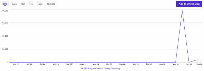
- Line: Ideal for showing trends or changes over time.
- Area: Similar to line charts but with areas filled in below the lines, making it useful for emphasizing magnitude or proportions.
- Bar: Effective for comparing values across different categories.
- Pie: Useful for showing proportions or percentages of a whole.
- Table: Presents data in a structured format, suitable for detailed examination or comparison.
- Number: Displays a single numerical value, suitable for highlighting a key metric or KPI.
Creating a Custom Dashboard using the Query Builder
- Go to the Query Tab in Hatica's Explore Page: https://app.hatica.io/explore (opens in a new tab).
- Use the query builder to define Measures, Dimensions, Segments, Time Duration, and Filters.
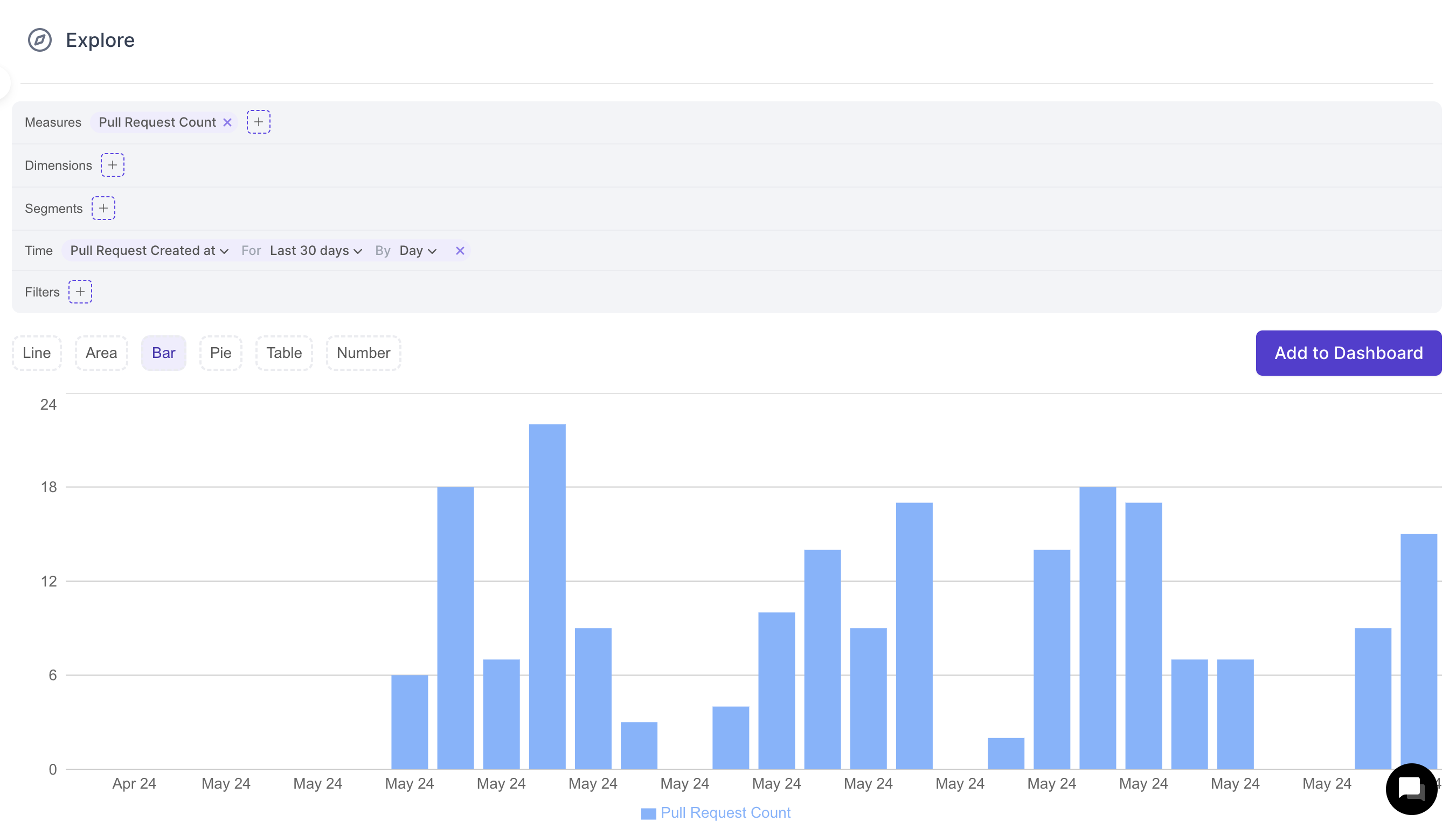
- Select the appropriate chart type to represent your data.
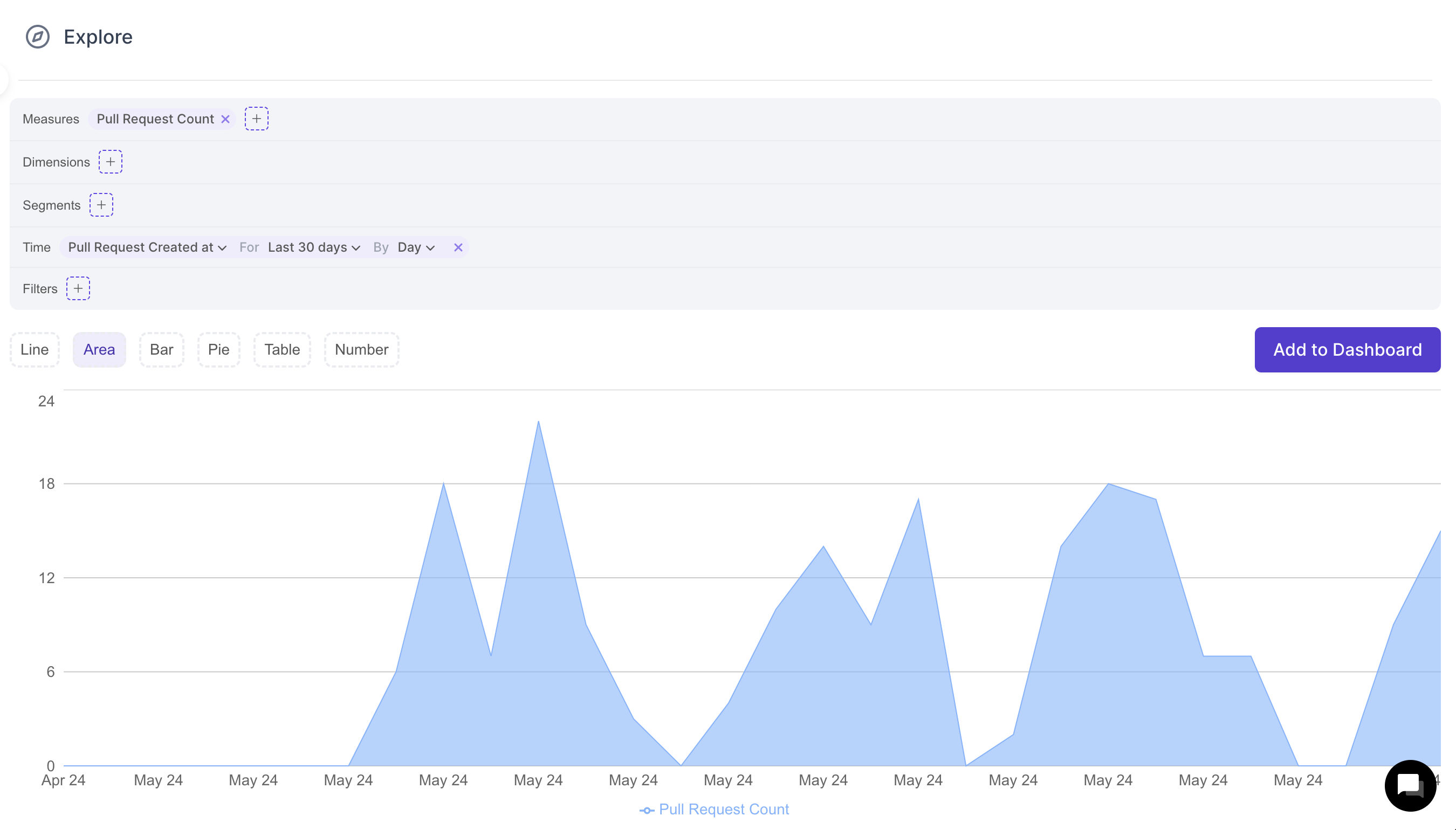
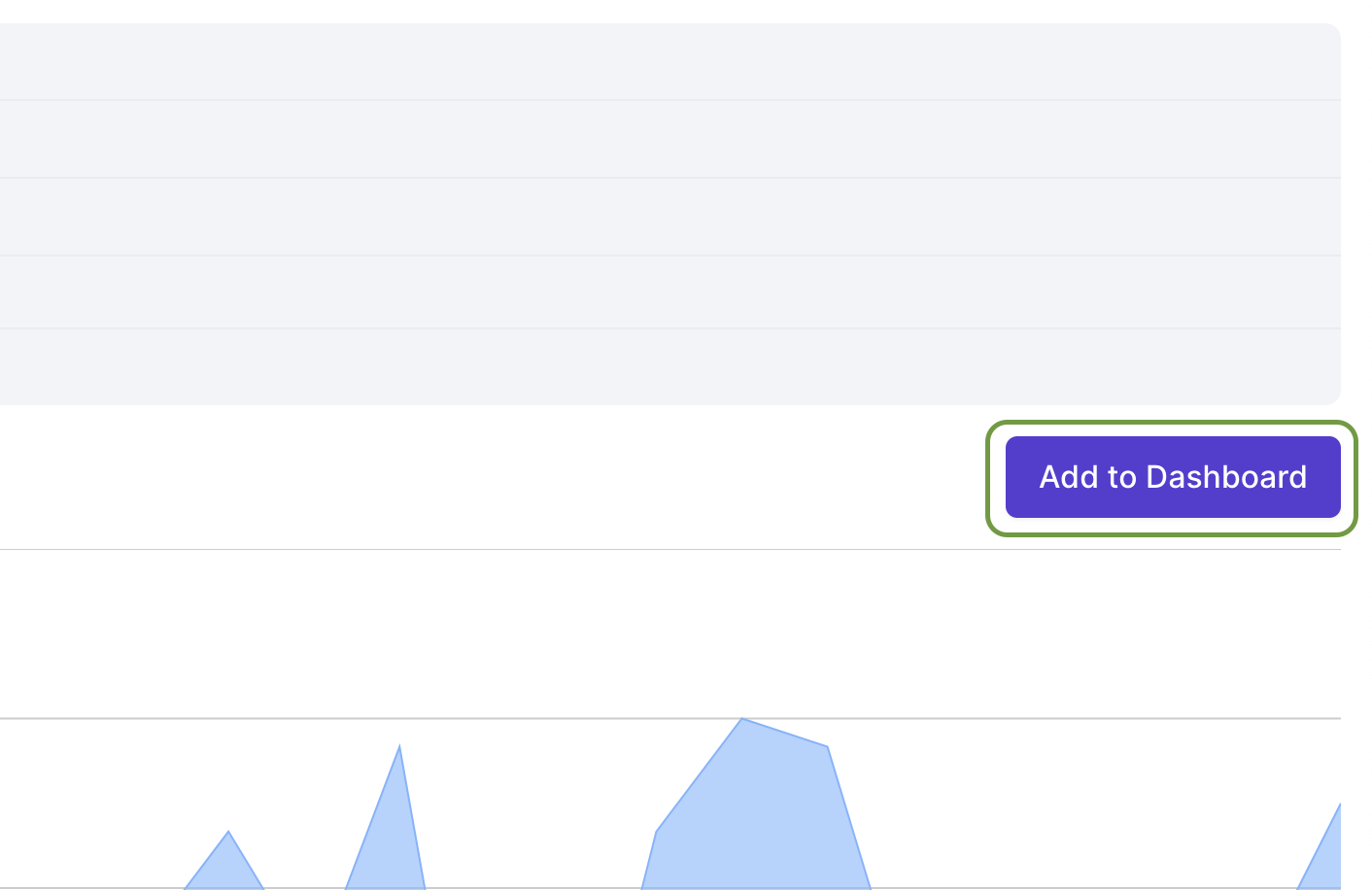
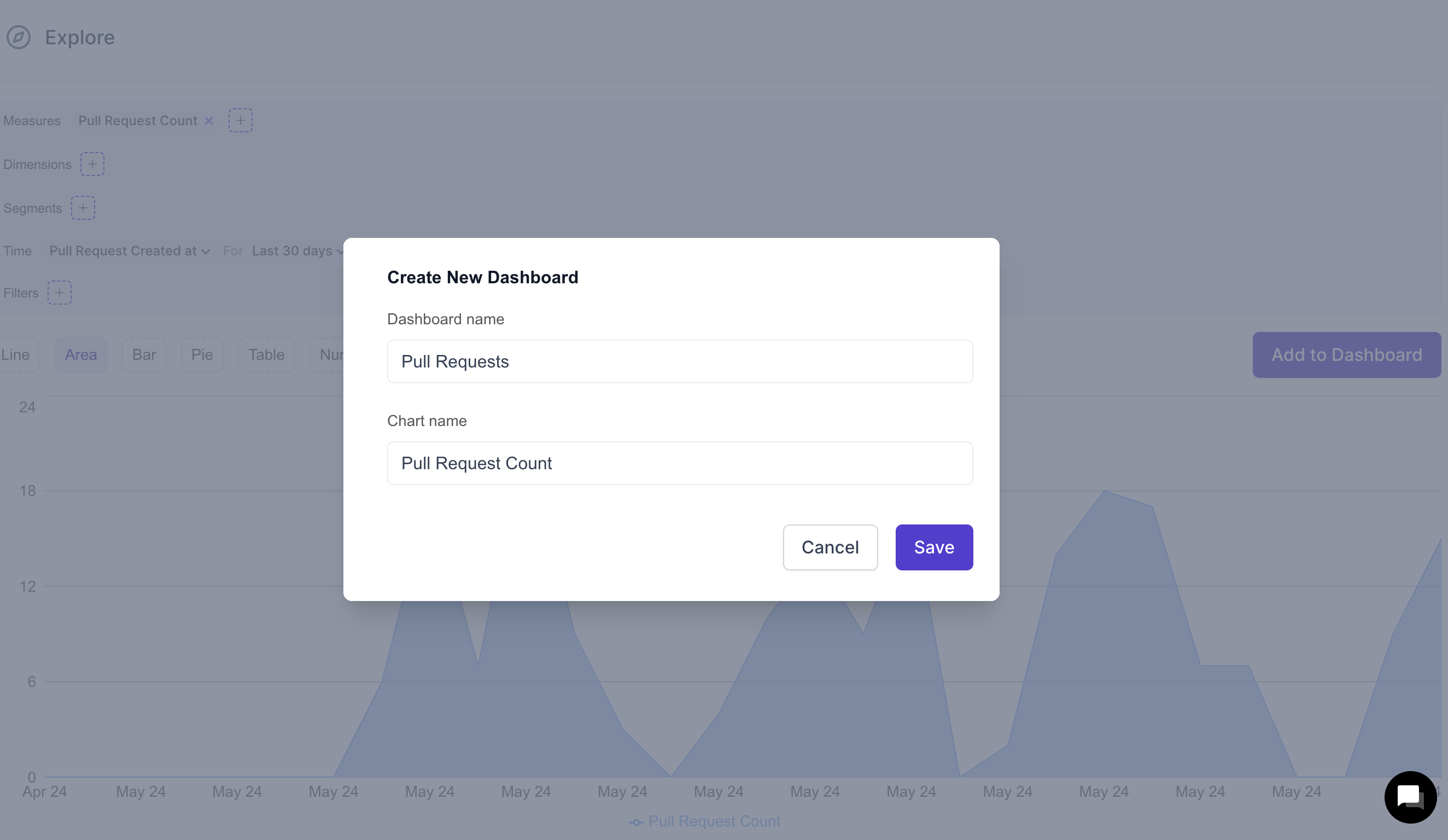
- Click "Add to Dashboard" to save your widget.
- Click on create a new dashboard. Dashboards help you organize and monitor your data effectively. Provide a name for your chart and click "Save".
Metrics Tab
The Metrics Tab offers a quick and easy way to access predefined engineering productivity metrics, eliminating the need to create custom queries. With just a few clicks, you can filter, compare, and visualize key metrics to track team performance
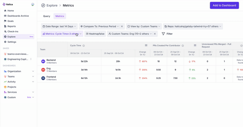
Filters
- Date Range Picker: Select the time range for which you want to view metrics.
- Repository Filter (Multi-select): Filter the data by one or more repositories to focus on relevant data.
- Metric Filter (Multi-select): Choose specific metrics to display in the grid. Select up to "n" metrics.
- View by Teams/Individuals/Projects: Toggle between displaying metrics for teams, individual contributors, or projects.
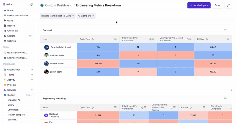
Features
- Enable/Disable Heatmap: Allows users to toggle heatmaps on or off for easier interpretation of the grid’s data. Heatmaps highlight areas of concern or improvement by color-coding metric values.
- Compare Periods: Offers an advanced control to compare the primary date range with a custom period in the custom dashboards.
- Share Custom Dashboards: Share View Access of Custom Dashboards with users with Member Access.
Creating a Custom Dashboard using the Metrics Grid
- Go to the Metrics tab in Hatica's Explore Page
- Customize the grid by applying filters (such as date range, repositories, teams/individuals, and specific metrics).
- Optionally, use the Compare Periods control to analyze performance over different periods.
- Click on "Add to Dashboard" to save your customized grid as a widget in a new or existing custom dashboard.
- Select or create a dashboard to save the widget and view it regularly.
Compare Periods
The Compare Periods feature allows you to compare the selected date range with a custom period in your custom dashboards. This feature is only available for widgets created using the Explore > Metrics Grid.
Adding a Compare Period
- Click the “Compare” button next to the date range selector.
- Select the comparison period:
- Custom: Select a custom period using the date range selection.
- Previous Period: Compare your selected date range with the preceding one (e.g., if you’ve selected the last 7 days, it will compare against the 7 days prior).
- Year-over-Year: Compare your current range with the same period from the previous year.
- Month-over-Month: Compare your selected range with the corresponding period from the previous month.
- The grid will display all metrics for both the selected period and the comparison period, along with the percentage change between the two.
- Save the dashboard with the selected date ranges for future reference by clicking the "Save" button and creating a saved view for quick access.
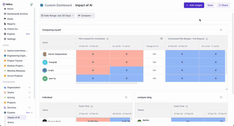
Share Custom Dashboards
Admins can share view-access of Custom Dashboards with Members and Teams. When a dashboard is shared, members will be able to view it within their Hatica instance. Note: This feature is exclusively available for widgets created using the Explore Metrics Grid.
Since members belong to a limited set of teams, view access respects existing access controls. This means members will only see the data they have permission to view within the metric grid.
Sharing a Custom Dashboard
- Go to a custom dashboard that youo'd like to share.
- Click the "Share" button at the top right of the dashboard.
- Manually add members/team who you would like to share the dashboard to.
- Click on Share Access.
- Set the general access setting basis your preference
- Restricted: Only users who have been manually granted access can view the dashboard.
- Anyone at your Organization: All users within your organization who have log-in access to Hatica can view the dashboard without needing an invite or link.
- You can also copy the shareable link and share it with users. The visibility of the dashboard via the link will adhere to the selected general access settings.
- To remove a member or team’s access, navigate back to the Share Modal. Click the Revoke Access button next to the member or team you wish to remove.
Managing Custom Dashboards and Widgets
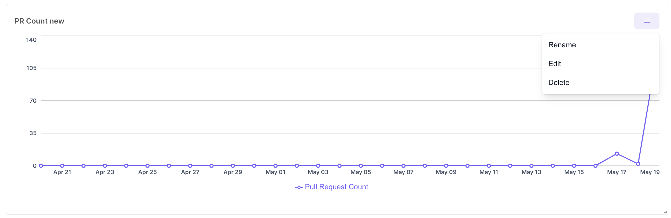
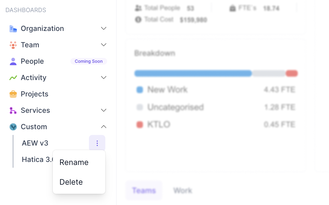
- Rename and Delete Dashboards: Custom dashboards can be found under the “Custom” view in the Dashboards list. Click on the three dots next to a dashboard name to rename or delete the dashboard.
- Edit or Delete Widgets: To manage individual widgets within a dashboard, click on the three dots at the top right of the widget. From there, you can rename, edit, or delete the widget as needed.